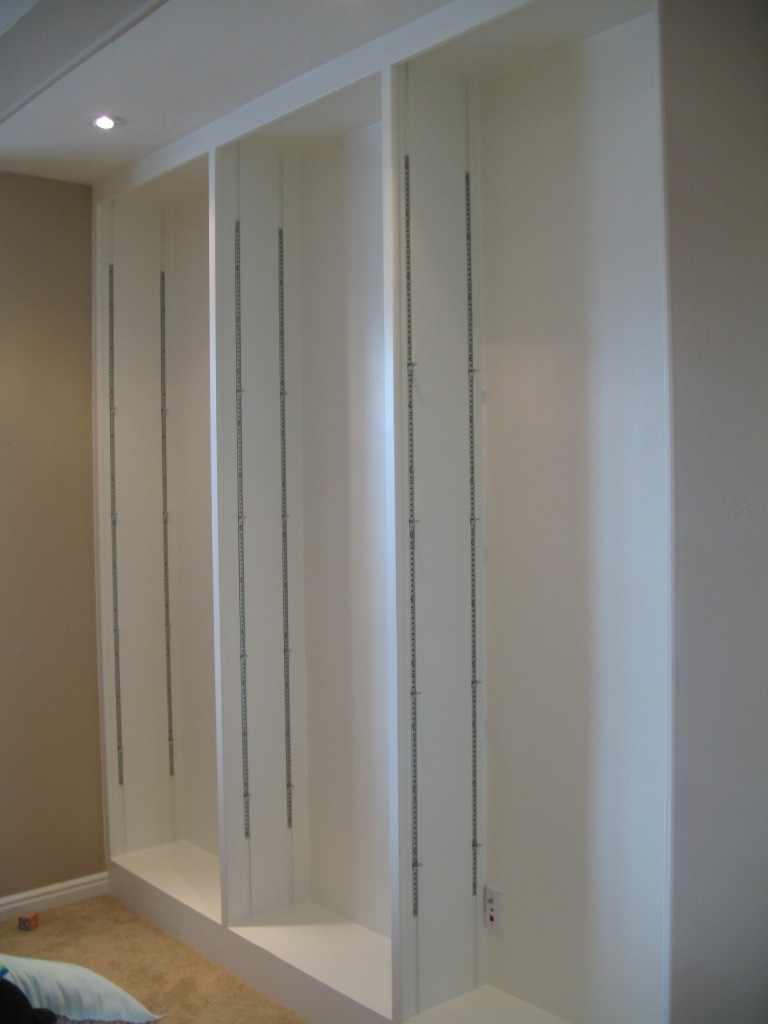
I am in the middle of trying to cute-ify Emrick’s play room. Nothing fancy, and nothing too permanent, since we will probably want to reclaim this room for grown-ups some day. But I’m trying to add a few touches to make it more homey, less junky, and easier to organize. The room was originally intended as a study (and we used it that way for almost two years, before deciding that the size of our rarely-occupied “bonus room” made it better suited for that purpose), so there is a built-in bookcase with adjustable shelves already in place. The whole thing was white, which was starting to seem too bland for a play room.
For weeks I was eyeing the white background, and thinking about how I could punch it up. Wallpaper is too permanent (and expensive). Fabric would be cute, but I would have to attach it to something else (like poster board maybe) before attaching it to the back wall there. And besides, a supercute fabric can be pricey, too, and frankly, it just sounded like too much trouble. So I decided to just paint it a bright, fun color.
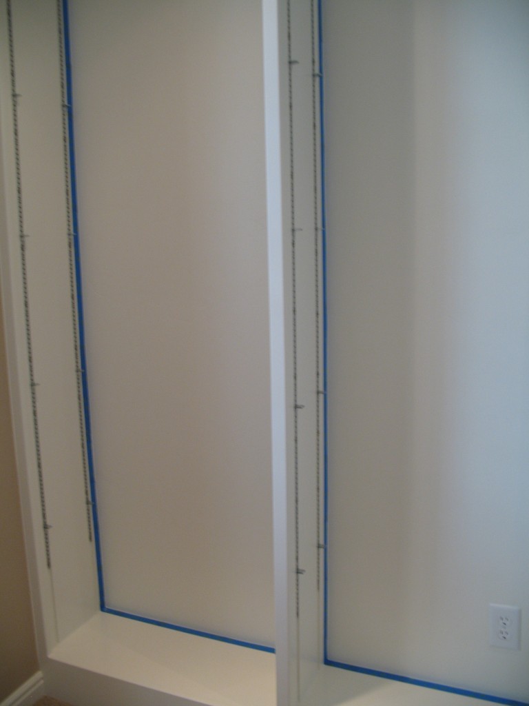
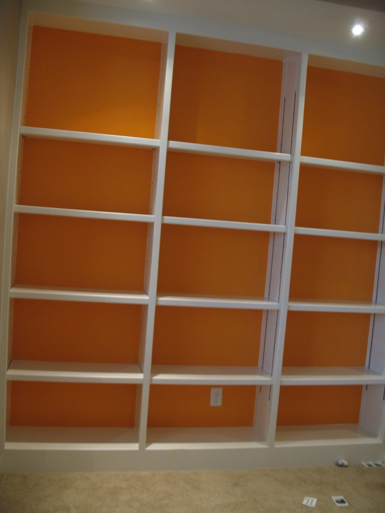
I taped off the cases with painter's tape, and then I applied a quick coat of primer to ensure my color stuck well, since the white paint that's already there is a latex semi-gloss.
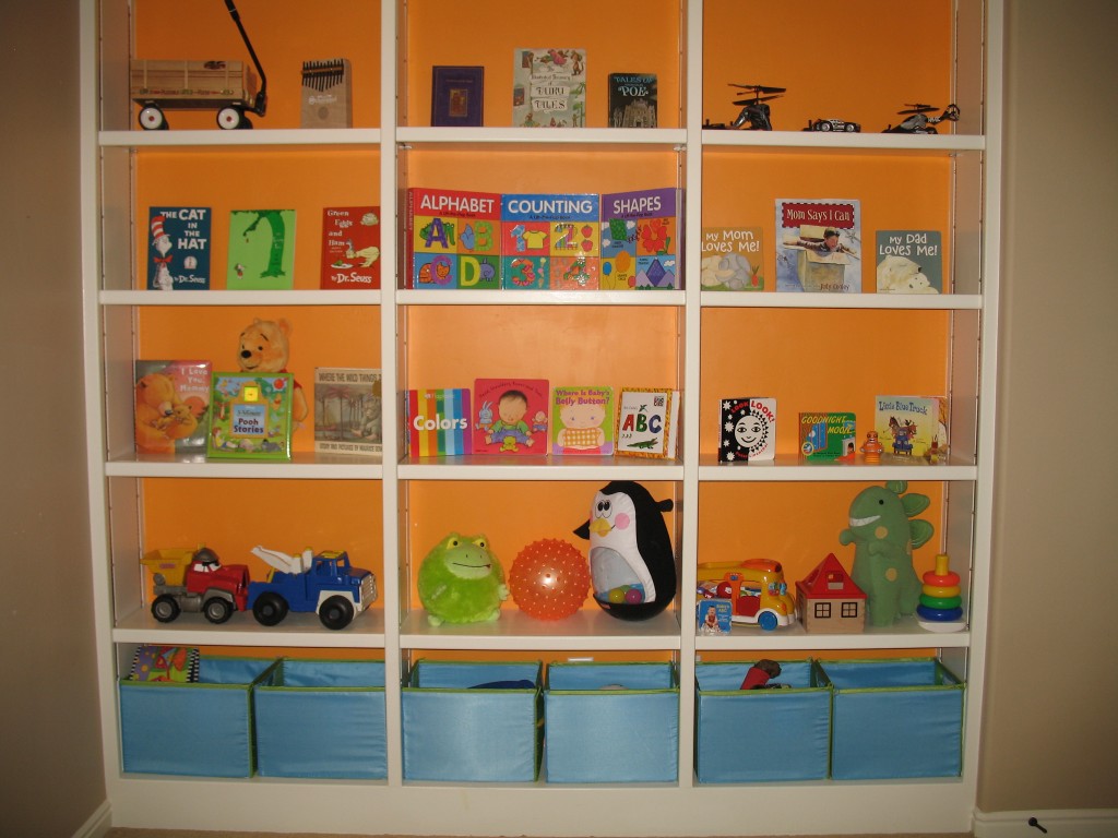
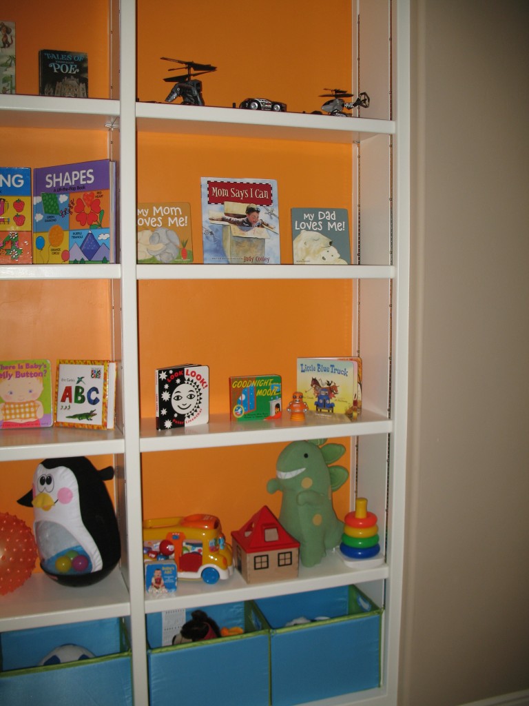
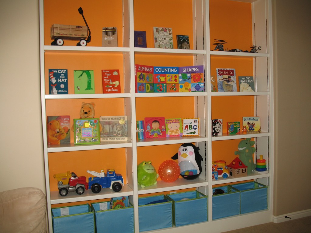
Doesn’t it look more cheerful now? The great thing about it is that I didn’t need to buy a whole gallon of paint… just one quart, actually. And everything else — the primer, the paint rollers and paint tray, the painter’s tape — we already had on hand. Plus, even after applying THREE coats of orange, I still didn’t use the whole quart, so I have some leftover for any dings that may happen. Here are the shelves again, loaded up with toys and books:
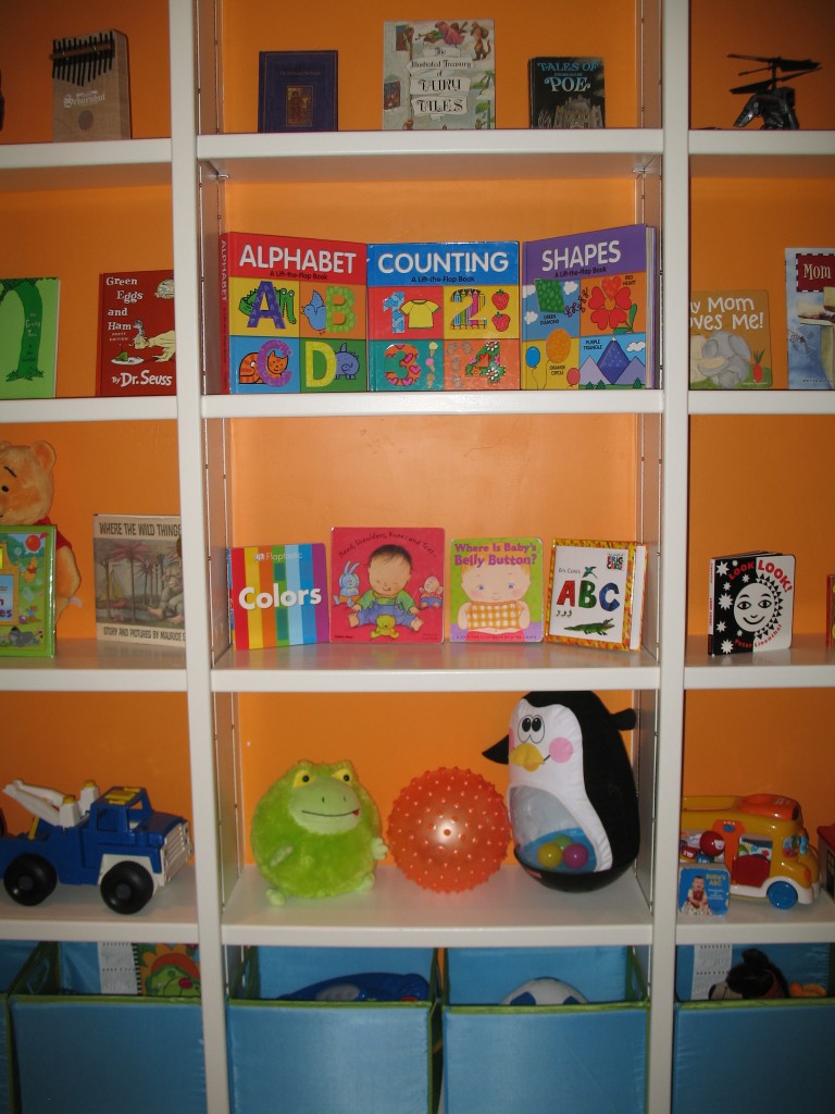
On the bottom are six collapsible boxes from Ikea, which are an organizational and aesthetic improvement over the single, giant laundry basket that we had previously been using to house all of Emrick’s toys. Of course, this room gets havoc wreaked on it every day, but it takes five minutes at most in the evening to get everything neat again. For now, books are being kept out of Emrick’s reach because even though he’s gentler with them than he used to be, he’s still a little rough and treats them like any other toy that can take abuse. Once he is old enough to understand the difference between a book and a toy that he can kick and throw around, we’ll put the books within his reach. For now, book time is supervised!
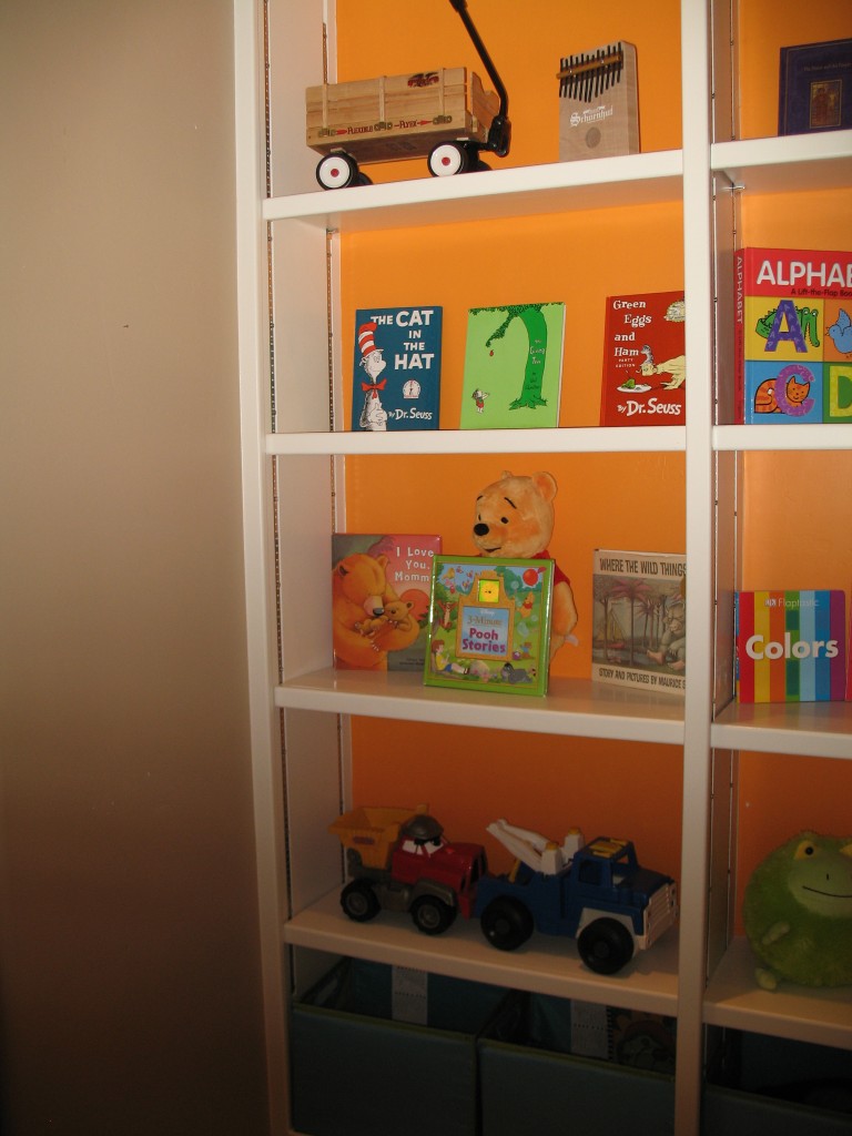
The very top shelves contain toys that Emrick is a bit too young to handle unsupervised. That wagon up there has sharp metal edges, for instance. I don't think it's actually intended as a child's toy, but it sure looks cute in the play room so there it is!
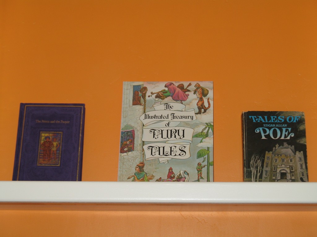
The top shelf here contains books that Emrick won’t be able to appreciate for several more years. For instance, there’s a copy of The Tales of Edgar Allan Poe* on the top shelf. When Marcus first saw that I moved that book from my own collection to Emrick’s, and that I then took a picture of it for this post, he asked, “Did you put that there as a joke??” I don’t know what he’s talking about. It’s never too early, if you ask me, for a child to read his first story about people getting buried alive, or psychologically tortured in the face of certain death. The last thing you want is a complacent or naive baby. Right?
The next steps are to 1.) Put in a small play table. Emrick is learning to color, and we want him to have a reachable surface he can do that on that is NOT our coffee table. I bought one from Ikea today in fact, which I liked because it has a laminate top which is WASHABLE; 2.) Finally make the alphabet wall I’ve been thinking about for months (something along the lines of this, this, or this). I have most of my letters, I just need to get started painting them, etc.; and 3.) Decide on a map to buy. We like the idea of having a map in the play room because they look interesting and you can learn from them, too!
National Geographic makes some beautiful maps, and I am trying to decide between two in particular, one positively enormous blue/green one that’s a STEAL right now at 50% off, and another that is earth-toned and more practical in size.
THIS IS WHERE I WANT INPUT FROM YOU PEOPLE.
The huge, blue and green one on sale is here.
The smaller, earth-toned one is here.
Now, what I REALLY want is a HUGE, EARTH-TONED one, which they DO have, but it is 116″ wide, which is too big for our 112″ play room wall. I do not want to cut it down. But for some reason, their blue and green version of the HUGE map, is just 110″, making for a perfect fit! But I prefer the earth-toned look. So my choice is between a roughly 9’x6′ blue/green map, or a 4’x6′ earth-toned map. One is a a great size, one is a great color. What to do?
Champagne problems, I know (wink at Chris).
PROS of buying the 4×6 earth-toned map: it’s the color I like, its smaller size gives us more options if we ever decide to relocate the map, it’s still pretty big.
CONS of buying the 4×6 earth-toned map: the only con really is that it won’t be as interesting as a map that takes up an entire wall. The customer reviews of the 116″ version of this map all talk about how IMPRESSIVE it looks in person. This smaller map wouldn’t have that same impact. Also, I wonder if it’s insane to spend ten dollars more on the SMALLER of the two maps! Should I be seizing the opportunity to get the huge one (even though I would have to get the BLUE huge one ’cause that’s the only one that will fit) at half price? (We are NOT going to pay full price for the huge one). Once again, here is a link to the 4×6 earth-toned map.
PROS of buying the 9×6 blue/green map: It is huge and would look so neato taking up nearly an entire wall. Also, maybe the bright blue is better for kids. After all, I want this to be something that our kid(s) are eventually interested in actually looking at and learning about. Maybe blue would make it more interesting to kids. And the price right now is great. $49.95 is no drop in the bucket, but it is half of the usual price and from what I have read, the quality is excellent. This map should be around for decades, which makes it worth the price in my book, especially since this sale price puts it at ten dollars less than the smaller one!
CONS of buying the 9×6 blue/green map: Again, the color. I am afraid that the blue might make the room TOO bright, especially with the bright orange we have going on in there now. I also wonder if the blue would make it look to school-ish. I mean I want the play room to be bright and fun, but also warm and home-like. Another link to this map.
So tell me what you think. I am leaning toward one, but I won’t say which.
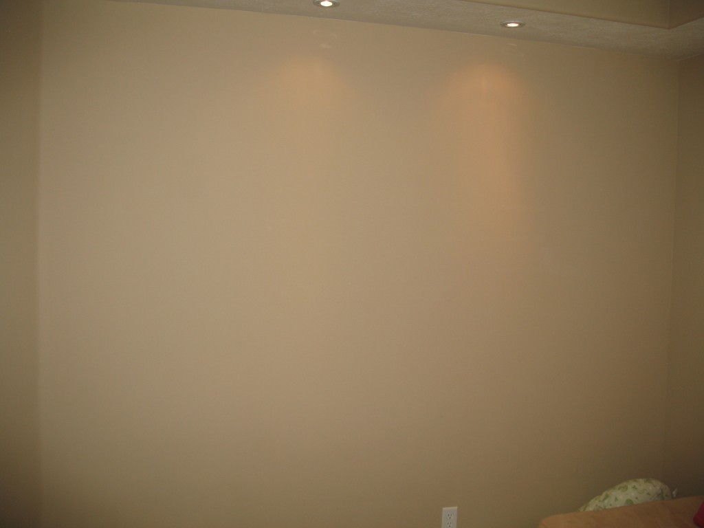
Here’s the wall it will go on:
And the other walls, for perspective:
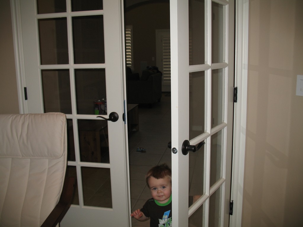
This is the entrance. This wall is small and only has room for the doors that are already there. I spy a Pooks.
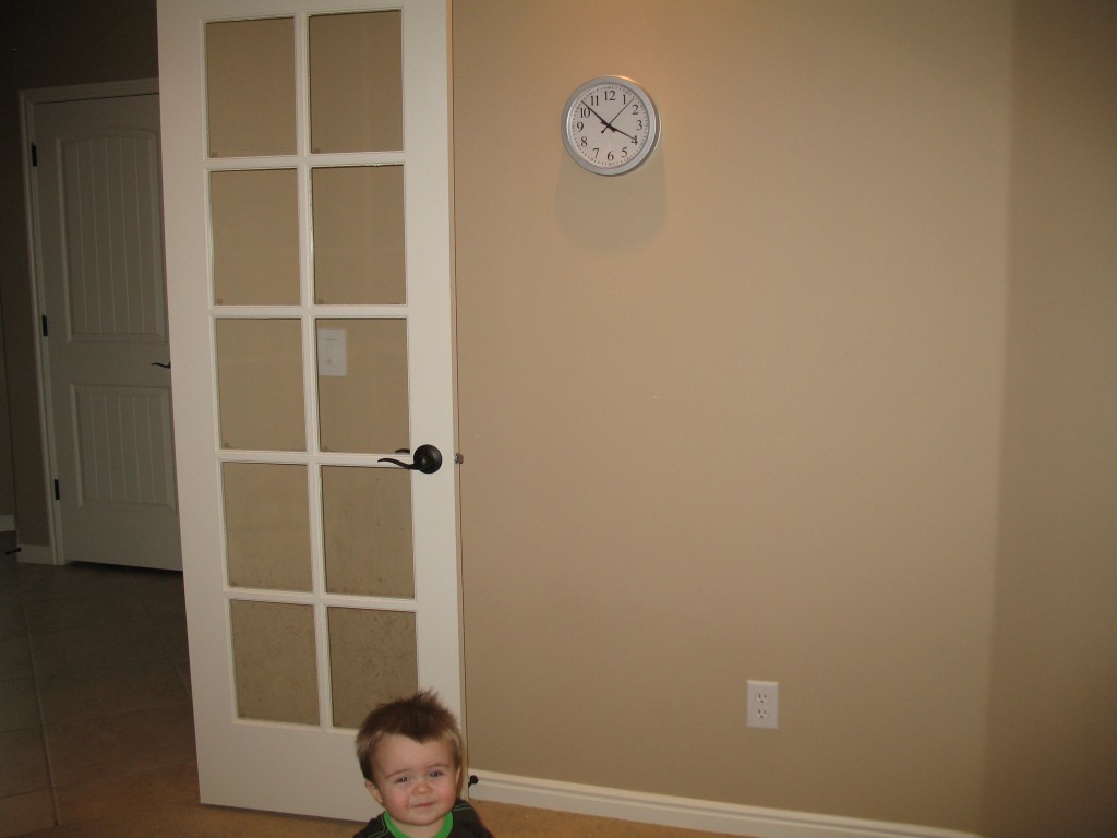
Adjacent to the door wall is the diagonal wall, making for an awkard-to-arrange, five-wall room. This is where I will put the alphabet.

And again, next to the diagonal wall is the (future) map wall. This wall is directly opposite the orange built-ins.
So there you have it.
*The EAP book has Clark’s name in it, printed when he was obviously a kid. So technically, it’s Clark’s. And I would be happy to send it along to him if he would like!

22 comments
Skip to comment form
I love the shelves and the color scheme….can’t give you advice on the map…love them both.
I happily bequeathe unto my nephew the EAP book.
Now, the table dilemma is easy:
1) Have Marcus carve you a custom sized table to fit out of his famous homemade cheese. Use a dry cheddar for stability; but use a nice chèvre around the edges in case pookie hits his head.
2) Stain it a lovely earth tone using Marcus’s famous homemade ale (or a porter if you prefer a darker tone).
3) When it is time to reclaim the room for adult use, hopefully Marcus will have figured out how to make dry salami and cabaret crackers, just eat that sucka out of the way.
Send all payments for this stroke of genius to the charity of your choice.
Merry Christmas!
Did I say table? I meant a map. Yeah, I totally misread that. I’m still pretty funny though.
Author
All comments so far are useless! Try again, folks!
I like the earth tone color map too, however, your walls are earth tone and might the map kind of disappear into the wall? For a play room, I do not think you can have too much color. My vote would be for the big blue! Also, in looking at the three types of alphabet walls, I kind of like how the second one uses a globe for the W, which made me think it would be neat to do that with a few of the letters, if not all of them. Like the B could be a ball, M a mirror (that’s all I got now, it’s late and past my bedtime), you get the gist. Love what you have done so far.
Author
I thought of doing that with a few of the letters too, actually. A mirror for M is a great idea! And I know what you’re saying about the earth-toned map blending in with the wall, but then I also thought maybe that seamless effect could be cool. I don’t know! Lots to consider!
See, everybody? Sam’s comment is best so far. She offered an opinion on the matter I asked about (ahem, Clark), as well as some additional ideas and things to think about. A+, Sam!
P.S. Thanks for your bequeathing, Clark. I am sure Emrick will appreciate it some day!
I vote for the smaller earth tone map mainly because it will be much more accessible for the Pooks ( and anyone else as well ). I’m not of much use on the alphabet because my preference is for something that looks more like the real thing — and you could probably find something at a teacher’s supply store. Love the orange, hope he doesn’t decide to climb the shelves!
Author
Yeah, the size of the bigger one may be a bit unwieldy, but I think even the smaller 4×6 one will be hard for Pooks to see initially. Hmmm… maybe I’ll scrap the map idea and get him a globe instead (which would have to be kept out of reach with his books if I didn’t want it to be used as a soccer ball!)! Just kidding; we’ll still get the map.
On the alphabet wall… I did consider that as an educational tool, the wall will have little value for a while, but I love the look of it and I think once he knows the alphabet someday, Pooks will like it. Maybe he’ll find it fun if I let him re-do the letters E, B, and S, to put his own creative touch on it (when he’s old enough). Until then, I definitely plan to get flash cards with normal letter shapes on them for him to learn from.
Author
Also, I purposely bought letters that are all capitals, and not overly stylized, even though they are indeed different fonts. It’s one thing for him not to learn much from the wall at first, it’s another if it actually confuses him, which I think a mix of capitals and lower cases would do.
I love all three “this”s? I love the blue map…….although it doesn’t have any ratings so I would make sure you can return it. It seems to be a bit less busy than the earth tone one and I suspect you will not have it up there forever since countries change names and boundaries……( Either Map, he will need a step stool to look at!) I do love the orange wall behind the shelves. Pookie is a very lucky Pook! Just sayin”.
Author
True. I hadn’t considered that some of the information on the map will surely change. Oh well — guess we’ll just stock up on Sharpies!
Pookie is lucky indeed, though I think Marcus and I are even luckier. 🙂
I think most of us would need a step stool!
You might check the reviews on Amazon for these maps. All are highly rated, and you can get a good idea of what installation and the final results might be. I would favor the smaller, earth toned map. 6′ x 4′ is still huge, but probably more appropriate for Emrick to learn from. Also, it is laminated, and more flexible for installation, or later movement. The larger map is in three sections, and needs to be installed like wallpaper. Some of the reviews say that the earth toned map is more colorful than the pictures indicate. Also, if you buy it from Amazon, the price is less. (There might be a difference in published date, which should be a minor issue). http://www.amazon.com/World-Executive-Polictical-Enlarged-Tubed/dp/0792293177/ref=sr_1_8?ie=UTF8&qid=1323714900&sr=8-8
Great job on the Play Room!
Author
Thanks for the info, Dad! I didn’t think to check Amazon for their price on the smaller map. All I noticed is that they were charging full price for the 9 footer. I guess we’ve got a decision to make!
Another vote for Blue Map, for one thing it appears to come with a child for Emrick to play with. The brown map is perhaps more appropriate for someone with elbow patches on their sweater and an “early bird special” looming at 5 pm, not the young Indiana Jones we have here.
Author
And that puts Chris in the lead for Best Comment of the Year! 😀
True! Good one Chris! But I do like the thought and reasearch that went into Dad’s comment.
BIG MAP
MAPS ROCK
BIGGER IS BETTER
Orange table legs. Chalkboard paint for tabletop surface.
BAM!!
🙂
Author
I actually already considered chalkboard paint for the table top, but I wasn’t sure if things would get too messy/complicated if the table doubled as chalkboard. I’ve also heard that things written on the paint don’t erase very well. I have no idea if that’s true or not. Maybe I will sample it on something else first!
Map of “Middle Earth”
I think this matter has been settled.
Author
You are certainly your father’s daughter, Anna :)… but I’m just not sure we want to hasten the onset of Emrick’s geekery!
I resemble that remark!